Group and Effect Analysis: Causal Forest
Compare groups instantly — and know which differences actually matter.
Averisys — an AI‑based decision intelligence data analytics platform — uses Causal Forest to compare your groups side by side, estimate effects, and tell you whether the differences are real or just noise.
Trusted by leading organizations






Find out what's really different — and what isn't
Are some regions outperforming others? Do different campaigns produce different results? Is one supplier consistently better than the rest? These are the kinds of questions Averisys answers — quickly and clearly.
Instead of eyeballing spreadsheets or guessing from averages, Averisys uses Causal Forest to compare your groups side by side, estimate effects, and tell you whether the differences are real or just noise. No guesswork. No second-guessing.
What you can do
- Compare performance across regions, teams, products, campaigns, or any other groups
- Find out which groups are truly different — and which just look different on the surface
- Pinpoint where the biggest gaps are, so you know where to focus
- Get clear answers whether you're comparing 2 groups or 20
- Share results with your team in ready-to-present reports
See your groups side by side
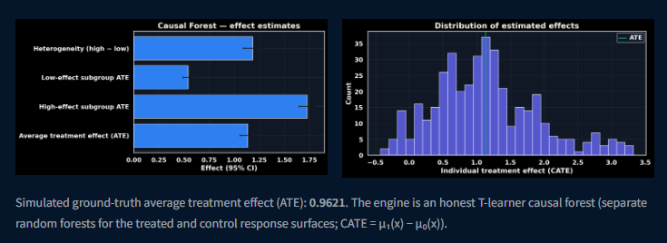
01 / Functionality — effect charts
Averisys AI Data Analytics Platform shows the average effect next to the high- and low-effect subgroups, and plots how the effect is spread across individuals.
- Effect estimates with 95% intervals for the overall group and each subgroup
- Distribution of individual treatment effects, so you can see who gains most
- An honest T-learner causal forest: separate forests for treated and control outcomes
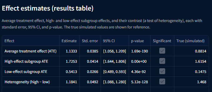
02 / Effect estimates (results table)
The average treatment effect, the high- and low-effect subgroup effects, and the contrast between them — each with a standard error, 95% confidence interval, and p-value.
- Average treatment effect for the whole population
- Subgroup effects for the strongest and weakest responders
- A heterogeneity contrast (high − low) that tests whether the gap is real
- Significance flagged for every row, with true simulated values shown for reference
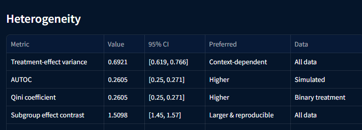
03 / Heterogeneity
How much the effect varies from person to person, and whether targeting the strongest responders is worth it.
- Treatment-effect variance, read in context rather than as higher-is-better
- AUTOC and Qini coefficient — higher values favour targeting
- Subgroup effect contrast: larger and reproducible is preferred
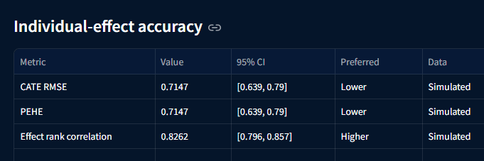
04 / Individual-effect accuracy
How closely the estimated effect for each individual tracks the truth, and how well the ranking of individuals holds up.
- CATE RMSE and PEHE — lower values favour accuracy
- Effect rank correlation — higher values mean the ordering can be trusted for targeting
- Each metric reported with a 95% confidence interval
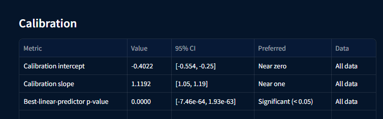
05 / Calibration
Whether the predicted effects are sized correctly — not systematically too large or too small.
- Calibration intercept, preferred near zero
- Calibration slope, preferred near one
- Best-linear-predictor p-value, showing real signal when below 0.05
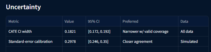
06 / Uncertainty
How precise each estimate is, and whether the reported precision can be believed.
- CATE confidence-interval width — narrower is better when coverage stays valid
- Standard-error calibration — closer agreement means honest error bars
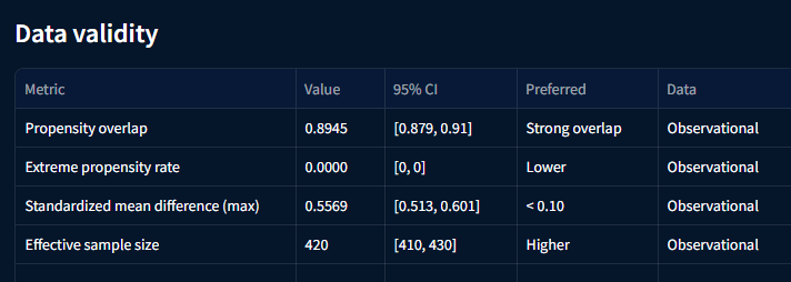
07 / Data validity
For observational data, whether the treated and untreated groups are comparable enough to support a causal claim.
- Propensity overlap — strong overlap is preferred
- Extreme propensity rate — lower is better
- Standardized mean difference, preferred below 0.10
- Effective sample size — higher means more usable evidence
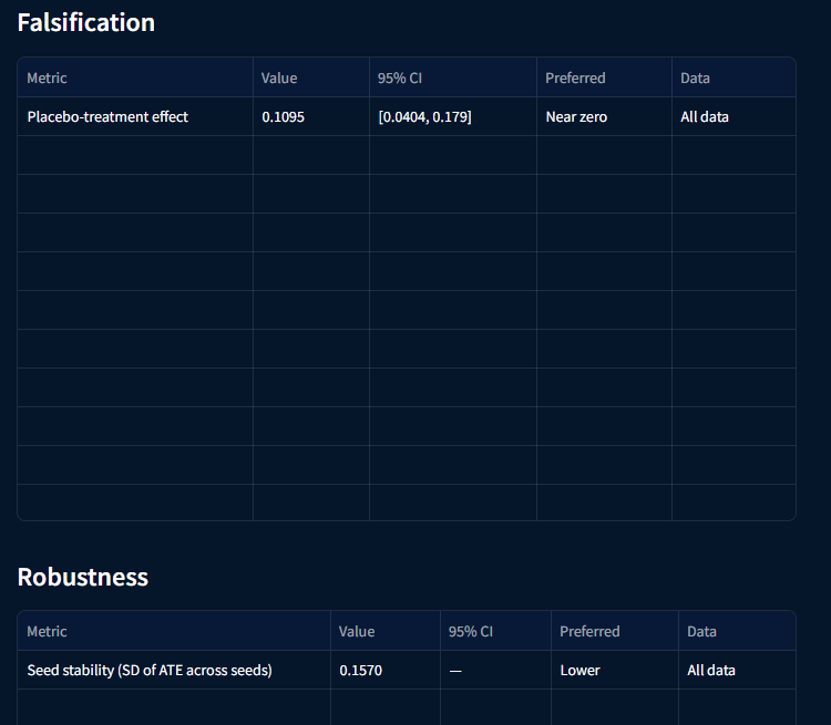
08 / Falsification and robustness
Deliberate tests that try to break the result, so a finding is only reported when it survives them.
- Placebo-treatment effect, preferred near zero
- Seed stability: the spread of the average effect across repeated runs, preferred low
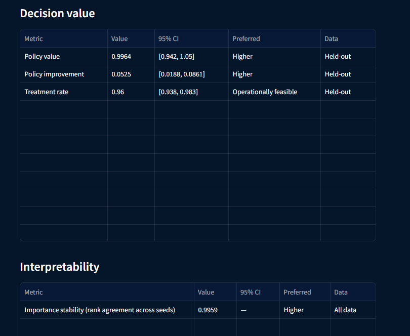
09 / Decision value and interpretability
What the model is worth in practice: how much better a targeted policy performs, and whether the drivers stay consistent.
- Policy value and policy improvement on held-out data — higher is better
- Treatment rate, checked for operational feasibility
- Importance stability: rank agreement of drivers across seeds — higher is better
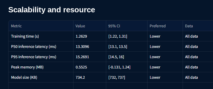
10 / Scalability and resource
What it costs to train and run the model, so results can be refreshed as often as decisions require.
- Training time and model size — lower is better
- P50 and P95 inference latency for real-time scoring
- Peak memory use, reported with a 95% confidence interval
Averisys Analytics guarantees its security.




Ready to see how your groups really compare?
Watch a demo and discover how Averisys — an AI‑based decision intelligence data analytics platform — compares your groups, explains the differences, and tells you exactly what to do next.